
What is data visualization?
Data visualization is part of the last step of the analytic process:
- Plan : Definition of the objective, with the characterization of key questions and the data sources
- Collect : Management of various data sources to limit bias
- Analysis : Assessment of data quality and depth of insights
- Report : Communication of insights and learning through a short story and visual supports.
So why start by the end of the process?
First because there are 2 dimensions in data visualization :
- The representation looks over the best visual arrangement for the data I want to explore.
- The presentation is about the best way to explain the data. How to make understandable, convincing and useful, the message that convey the data.
Second because the job in data visualization is undergoing fundamental changes, it becomes a multidisciplinary activity and visualization spirit is actually present on each step of an analytic process. Andy Kirk describe the “eight hats of data visualization design”.
- The initiator defines the scope
- The data scientist is the data geek, he finds insights
- The journalist is the storyteller
- The computer scientist have the IT expertise for production environment
- The designer is the creative, the artist
- The cognitive scientist knows how to mark on everyone’s mind
- The communicator is the public interface, the negotiator.
Personally I’d add the ninth hat : The manager who makes all these hats working together.
What are the stakes involved?
In a data driven business, information is supposed to be shared and scattered to every decision maker of an organization. Information should not be hoarded into pursuing a power quest. So the mission for data-scientists is to extract insights, information from data, admittedly. A data-scientist might be an analytical hard core geek and he/she might be delighted (Yes I might) with telling about, how their statistics and their algorithms are elegant and everything… But the more challenging is to convey, with passion, understandable, useful and original information to many different final users with various professional concerns. Here comes visualization as a support for a factual conversation and exchange. Because a picture often speaks better than words, visualization is the corner stone of information processing. So be it! But what do I have in my toolbox to make powerful visualization outputs? Before you read further, be aware that giving an exhaustive list is beyond the scope of this article. For a complete and updated list, please refer to http://www.visualisingdata.com/resources/
Hey man did you say Blender? I can’t see it in the list of visualisingdata.com! No probably you don’t. You can’t see Zepplin either.
Can I use OpenOffice calc / Excel?
If you are satisfied with it, if it meets your requirements, stick to it and fetch some Add_ins.
But please have a look to other tools, to get a qualified vision of the other possible outcomes.
Which tools for BI?
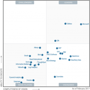
The Gartners 2014 Magic Quadrant notes three softwares as leaders. Tableau is very versatile, highly insightful and beginner-friendly. QlickView offers an even wider variety of features, but the learning curve is harder. Finally, Microsoft Power BI is less user-friendly than Tableau but offers some interesting functions such as Data Modeling Diagram View and a natural language- based querying .
The in-memory management of data of QlickView makes it the fastest. Tableau supports cubes (datamart) and is fast enough, however Microsoft Power BI is the slowest.
Microsoft Power BI is the cheapest, especially as it comes with the suite Office 365. Most importantly Tableau and Microsoft Power BI are available in free version. Be aware that in this case, all your documents are public so you have to avoid to visualize sensitive or strategic information.
I’ve got low amount of available money for software, but I’m not afraid about programming.
The open-source reference in statistics is R. Everything you could imagine about statistics is achievable with R. For graphics you should use the ggplot2 package for fancier graphics, knitr and flexdashboard
for dashboards. All of this in the R studio environment will make things easier.
Programmers used to the power and friendliness of Python, would appreciate (I do) the matplotlib, pygal, seaborn libraries. May be you could be interested in Jupyter as a working environment. Think about to installing Jupyter through Anaconda.
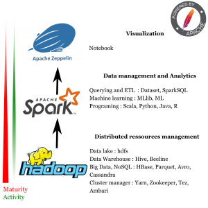
For web-oriented projects d3.js (Data-Driven Documents) is unavoidable. With d3 you’ve got a full creative control. It is a JavaScript library and a framework. It can be enhanced with dozen of other JS library such as dc , crossfilter. I can’t resist to make a personal special mention for the young project bokeh that will probably challenge D3.js in the future. It has multiple language bindings such as : python, R and Scala. Let me mention again Zeppelin as an apache incubating project which have the huge advantage to be connected to spark, so you can also make some visualization with spark. Why is that so important? Quite simply because spark is a fast growing project that will probably establish itself, into the hadoop environment, as a reference as a distributed processing framework for machine learning in big data, probably overtaking map reduce. Moreover SparkSQL deals with some functionality provided by some other Hadoop tools such as Pig, Sqoop and Impala. All good things for distributed data processing come in three with Apache and Hadoop!
If you still feel you can’t express yourself through these tools.
Congratulation, you’ve come up to there! May be Blender could be made for you. To get straight to the point, Blender is not a dedicated visualization tool, it is an open-source software for 3D modeling and animation. Beside to be a terrific software for 3D modeling, 3D animation, games development and video edition, Blender provides high level python API. So Blender can be controlled with python scripts that make it easy to program repetitive actions or to connect data to actions of 3D modeling and animation. Because a video is worth a thousand of words, you can have an idea of what can be done here where we represent the records of air captors in Paris (France) as a function of the speed of the wind, the intensity of the traffic, the distance from the traffic and the time. It is a 5 dimension-representation. You may probably know that more than two dimensions are seldom recommended in a data visualization representation, because it is too many distractions detrimental to insights. But it is a good way to catch the eye and the attention of your audience, before you give them insights coming from analytics. But remember, whatever the visual support you use, stick to the story, a short story to convince your audience, the stack-holders, that the story is their story, that your solutions are theirs.
I really like it when folks come together and share views. Great site, stick with it. Clemmy Eb Saffier
Cudos to you for caring about the usefulness of your content, and therefore your readers. Moll Claiborn Felicia